Tuesday, Apr 4, 2017, 11:14 PM EDT

Processing User Testing Feedback
I am doing a round of user testing based on a prototype developed after the quick and dirty show feedback which was incredibly helpful for me.
The material I am using for this round of user testing is my Getting To Zero forward facing thesis project. The version of the project used in user testing can be seen here
My major questions were about the first and third sections.

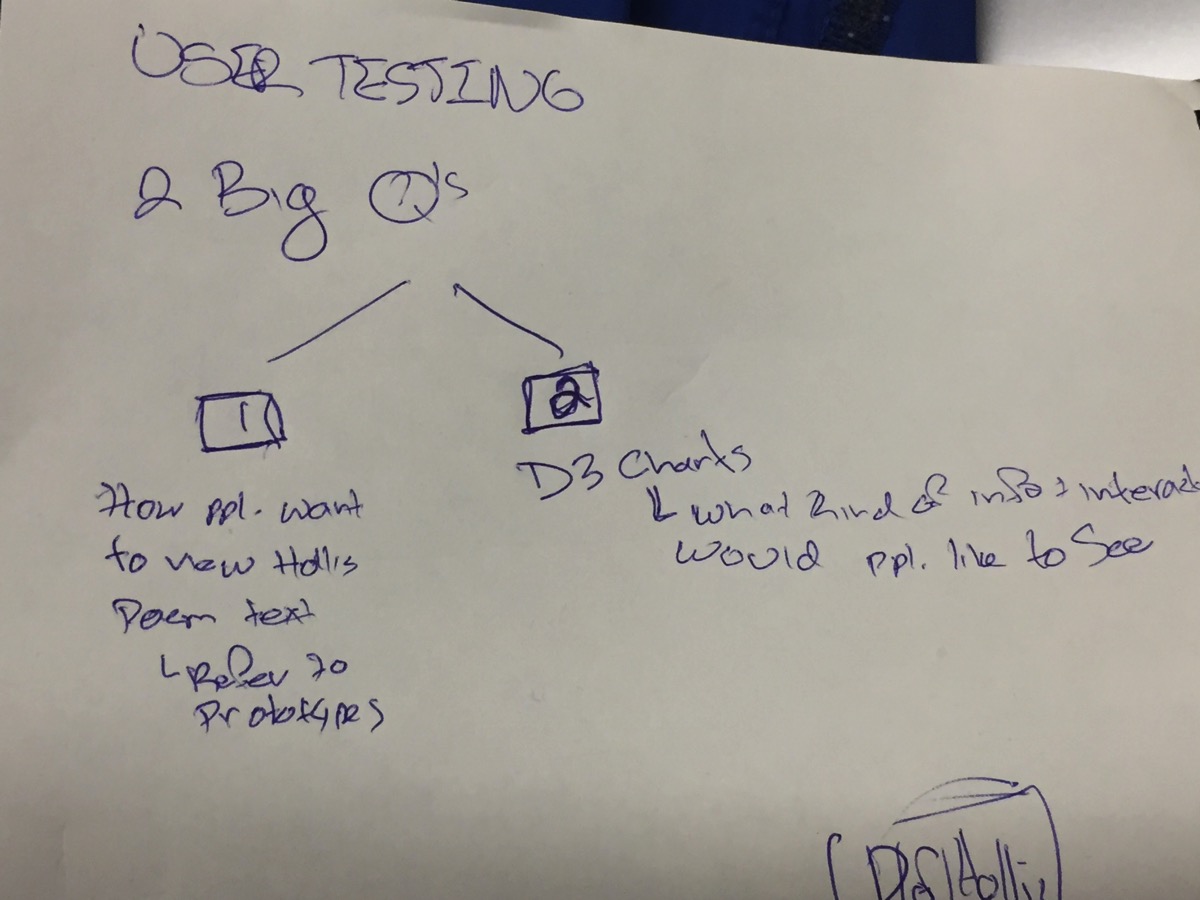
My big questions were
1. My first question is how users are interested in interacting with the data types of the poem
.
Question 2 is around what kind of information and interaction users would like to 'see,' in the D3 data visualization prototypes I have made, which {{explore? Hold accountable? Right word?}} humans imprisoned in the U.S. by state.

Two 'data types' of the poem:
1: The video of me performing the poem
2: The text of the poem-as it is performed in the video (as opposed to say the text of the poem that was written to then be performed on stage).
I am thinking and dealing with each of these as discrete data sets. A video file, and a text file; each of which hold the data of the poem.
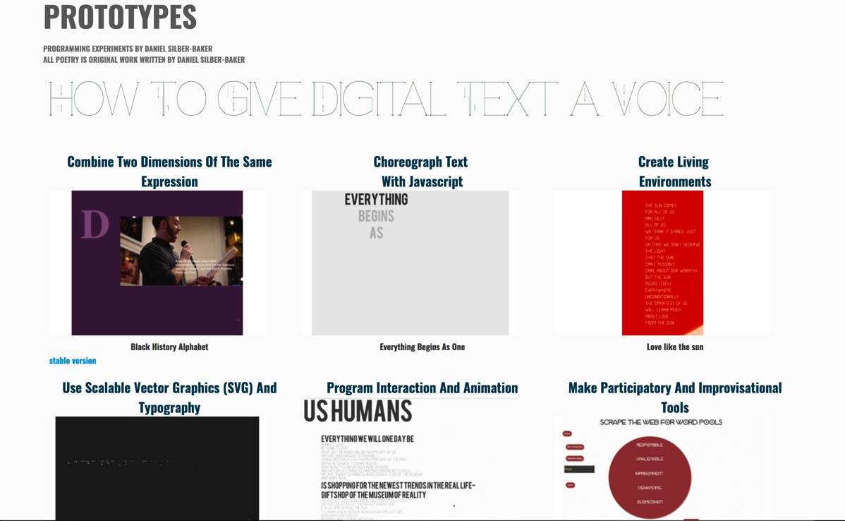
I am thinking about my prototypes from the quick and dirty show as the pool of possibilities in terms of what method I will employ to synchronize-or put into conversation the two 'data types' of the poem.
These methods can be seen on the prototypes page seen above:
So I asked people to watch the video and created a placeholder version of the text of the poem, which is placed via a materialize.css grid next to the poem, in a separate column on the same row. As a user testing model I have placed the text of the poem in scrollable element using velocity
And then I showed, or reminded, for it was nice to have some returning user testers, the prototypes I developed for the quick and dirty show and asked user testers which to identify methods that the prototypes employed, that would feel effective in making the text interaction with the video effective and meaningful.
User Feedback Summaries
@Ella
- Ella gave me some great feedback about the overall feel and experience of the front end experience of the piece as a whole and individual elements. She showed me a few examples of simple design inconsistencies, e.g. images within the same row being different sizes, and the mis-alignment of text and images within the same column position. I find these insights invaluable in being able to quickly iterate through work.
- Ella also gave me some moving and effective high level feedback, for example (something like)
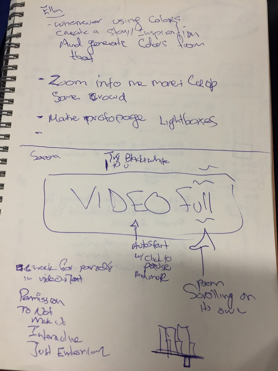
“Whenever using colors, create a story-inspiration and a feeling and generate colors from that.”
I have been working really hard on developing my understanding of color theory, and of how to use color effectively in creating meaningful ‘communiques.’ I learned pretty quickly into my time at ITP that color design was not something that came natural to me, and I have been pushing myself to acknowledge that area that does not come naturally to me, and I have found success in the safety of monochrome, mostly grey {{show}} palettes. Ella’s reflection felt to me like a reminder and permission to try and add color that comes from the same place as the stories I’m telling. I’m excited to generate some color palette ideas for ‘the place these stories come from.’ I imagine it will be more of an exercise that influences my final thesis design, rather then the palette itself, but who knows?!-I will very soon.
- 2 quick and helpful things
- Thinking about masking the video to focus more on the performance and less crowd. Which really opens up for me a space to think about how I might use the video data, the mp4 file that the poem recording is on, as a site for storytelling and expression in collusion with the overall and other elements of the project.
- We quickly looked at my demos page and Ella, I think correctly, suggested that each project could open up right on the page-as an overlay, so that users could experience each project without needing to leave the prototypes page. I think I could implement this effectively using the jQuery light boxes I was experimenting with in the {{link}} Making Data Meaningful Home Page
@Serena Feedback
Serena had some incredibly imaginative and specific feedback around envisioning the role of the video in the overall environment. I quickly sketched out some of her ideas, seen below. I am going to spend some time with the video file in Adobe Premiere, which was the excellent suggestion of a classmate who also did user testing with me today, @Francesca.

Serena also game me some permission around how ‘interactive,’ it needed to be, vs being something that people experience as a performance.
Serena also gave me some incredibly helpful advice on managing d3 charts, including the placement of the svg container and some ideas about setting width and height dimensions for the click to zoom interaction on the first D3 Chart.
{{show image?}}
Also the idea of the title being a sort of rotating headline ’1978-2012’ and have the circle packing chart animating back and forth between 1978 and 2012 numbers, in sync with the rotating titles. That might work well with my idea of the visualization being a part of a ‘poster introduction page.’ Where the circle that makes up the whole chart is either the 0 in “Getting To 0,’ or the o in ‘Getting To Zero.’ Or written with a variable
Var x = the {{image of the d3 vis)
Option A = Getting To x
Option B = Getting To Zerx
@Francesca Feedback
@Francesca convinced me to commit to trying the text over video method of synchronizing the text and video data.
I am going to take Fran up on her offer to work with me on the video of the poem in Premiere.
Premiere Setup
- duplicate Hollis.mp4 video
- put duplicate into premiere
- try sizing
- try color, mask, and export options
- try some magic with Francesca
The conversation about ‘the way we write by hand’ --> For section two Focusing on the animation-on the flow and emergence of the letters and meaning- instead of (what I have been fascinating on) the font to use to illustrate his particular handwriting. This is really deep good advice.
Understanding the replacement of data for words in my thesis title, but for her-there was more power in the use of ‘words.’ I hear you. I hear you. I’m gonna user test and soul search on this a bit.
