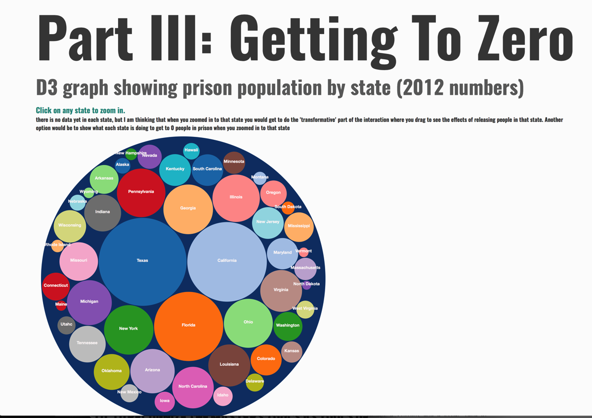
One of the main ways I will show how to make data meaningful, is through continuing to iterate and develop a project I have been working on since my first semester, which is a prison abolition project called Getting To Zero.
The project began in my Data Visualization class, as an attempt to create a transformative data visualization instead of just an interactive one. The key difference being, that a transformative visualization allows the user to actually change something; to explore options outside of just the reality being reflected back to them through the visualization. You can see the early development and read more about the project {{here-link to documentation and first prisons are obsolete page}}
The data that I am making meaningful in this project is data about U.S. prison populations {{cite}} which include my friend and brother, Christopher Hollis. I am going to use poetry, and the digital methods I have developed though my thesis work of manipulating text, in combination with the ability to interact with the data in meaningful ways using interactive/transformative visualizations to show how to make data meaningful and have the potential for transformative interactions, in this case centered on a persuasive environment in service of prison abolition.
The ideas here is to use digital methods of text manipulation, transformative data visualizations, and the power of storytelling to bring out and allow for understanding and interaction with the data about humans imprisoned in the United States.
The under construction version of this project with a roadmap for its final version can be seen here
Enlisting D3 JS
In order to most effectively communicate what I am saying around how to make data meaningful, I am developing my abilities with D3 js in order to create data visualizations to go along with the poetry and text animations I have been developing as examples of making data meaningful. I have started by making a circle packing chart representing the number of people in prison by state in the U.S.
Here is a video of my prototype animating the transition from the 2012 number of people imprisoned by state, to the future where that number for each state is 0.
d3_transitions_documentation from Daniel Silber-Baker on Vimeo.
My next step will be to work with D3 transitions to try and animate changes and potential changes over time in the data.
